Trades Website Examples: What the Best Trade Websites Do
Not a gallery of pretty sites. The patterns that make a trade website win calls, shown on demo designs I've built, with what each trade's site has to show before anyone rings.
Search for trades website examples and you'll mostly find galleries of pretty sites with no explanation of why they work, if they work at all. I'd rather show you what's on the page and why it's there. A trade website earns its keep when a stranger on a phone decides in a few seconds that you're real, local and right for their job, and then rings you.
So this isn't a list of tradesman website examples ranked by how nice they look. It's the patterns the good ones share, then a section per trade with what that trade's site has to show.
Trades website examples: what the best ones have in common
Strip away the colours and fonts and the trade websites that win work do the same seven things. Here they are, with how each one shows up on my demo designs.
1. The trade and the town in the first line
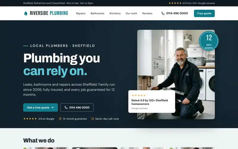
On my demo for a made-up Sheffield plumber, Riverside Plumbing, the first thing above the headline is a small line that reads "Local plumbers · Sheffield". A visitor knows what you do and where before they've read a sentence. Plenty of real sites open with "Welcome to our website" or a slogan about quality, which tells a stranger nothing.
2. A number you can tap without scrolling
Most of my demos have the phone number in the header, and on a phone there's a bar along the bottom of the screen with two buttons: call, or ask for a quote. On my PrimeFlow Plumbing & Heating demo the bar reads "Call Now" and "Free Quote", so ringing is one tap away wherever you are on the page. Most trade enquiries start on a phone, often in a hurry. If someone has to scroll back up or open a menu to ring you, some of them won't.
3. Services named the way customers say them
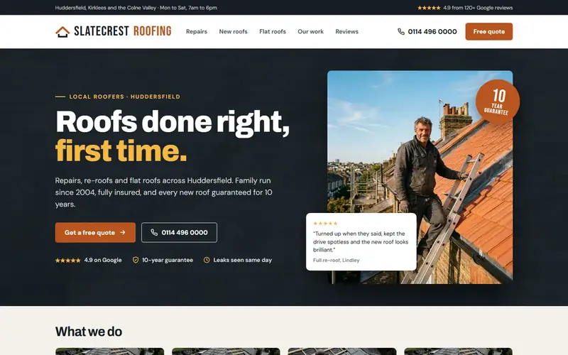
Look at the menu on a good trade site and it reads like a list of jobs, not a list of pages. My Slatecrest Roofing demo's menu says Repairs, New roofs, Flat roofs, Our work, Reviews. Not "Services". Each of those is its own page, which is also how the site gets found on Google for each job. One page called Services with eight bullet points can't rank for eight different searches.
4. Proof right next to the promise
The line under the headline on most of my demos follows the same shape: what you do, where, how long you've been going, that you're insured, and what the guarantee is. Then a row of three small trust points under the buttons: the Google rating, the guarantee, and something specific to the trade, like same-day call-outs. Specific beats vague. "Every new roof guaranteed for 10 years" does more than "quality guaranteed".
5. Real people, real vans, real jobs
The demos use a photo of a tradesperson actually working, not a stock model holding a clipboard. On a live site that should be you, your van, your work. A slightly wonky phone photo of a finished bathroom beats a perfect stock image, because customers have seen the stock one on ten other sites this week.
6. A short form for people who can't talk
The PrimeFlow demo's quote form asks for four things: name, phone number, postcode and a drop-down for the job. That's enough to ring someone back. Every extra box is another reason to give up halfway.
7. Areas and hours in plain sight
A thin strip across the very top of most of my demos lists the towns covered and the hours, like "Huddersfield, Kirklees and the Colne Valley · Mon to Sat, 7am to 6pm". It filters out jobs you'd never travel to and answers the question before anyone has to ask it.
Before and after: the same roofing firm, two websites
The clearest way to see these patterns is side by side. For one demo I mocked up a "before" site for the made-up Slatecrest Roofing, built the way plenty of trade sites from the 2010s still look:
- A headline that says "Welcome to our website!"
- A "Latest News" box announcing the new website is live, dated 2015.
- A services list ending in "And Much More!!"
- An email address that just says "click here".
- A visitor counter.
- Four small photos with no captions, and a mobile number in tiny text in the sidebar.
The "after" version keeps the same business and the same work. It just answers the questions in the right order: "Local roofers · Huddersfield", a headline that says what you get, repairs, re-roofs and flat roofs as separate pages, a 10-year guarantee in words, a tappable number and a "free quote" button. Nothing clever. It's the same information, arranged so a worried homeowner can act on it. I go deeper on this trade in roofing website examples.
Plumbing website examples: what a plumber's site must show
Plumbing customers come in two moods: panicking (water through the ceiling) and planning (a new bathroom next spring). The best plumbing websites serve both without making either one wade through the other's content.
- An emergency line at the very top, if you take emergency work. My PrimeFlow demo puts "24/7 Emergency" and the number in the top strip. Only say 24/7 if you'll genuinely pick up at 2am. If you won't, say your real hours.
- Separate pages for repairs, bathrooms and boilers, because the person pricing a bathroom wants photos and a process, and the person with a leak wants a number.
- Gas Safe registration, with the number, if you do gas work. By law, anyone doing gas work has to be on the Gas Safe Register, and customers are told to check the engineer's licence number on the Gas Safe Register website. Put the number where they can see it, so they don't have to ask.
- How you charge, in a sentence: call-out fee or not, fixed quote or hourly. It's the question every caller asks anyway.
The weakest plumbing sites I see list fifteen services on one page, show a stock photo of a chrome tap and hide the number in the footer. If you're a plumber, my page on websites for plumbers shows how I'd lay yours out.
Heating engineer and HVAC website examples
"HVAC" is mostly American wording. Homeowners here tend to search for boilers, heat pumps and heating engineers, while commercial clients are more likely to use HVAC. Write for the person you want to ring you.
My Ember Heating demo, for a made-up Rotherham firm, has a menu of Boilers, Heat pumps and Servicing, a headline that just says "Warm homes, no fuss", and the guarantee on new boilers in the line underneath. A good heating site also:
- Gives boiler installs their own page with the brands you fit and what the price includes.
- Treats heat pumps as a separate job with a separate page, because the questions are different (survey, grants, running costs) and the buyer is researching for weeks.
- Makes servicing easy to book, because a servicing customer is next year's boiler customer.
- Shows Gas Safe registration with the number, as above.
More on this trade at websites for heating engineers.
Builder and construction website examples
Builders sell bigger, slower jobs. Nobody hires a builder for an extension from one look at a homepage. They often come back to the site several times, show their partner, and compare you with two or three others. So builder website examples that work tend to be deeper, not flashier.
- Project pages, not just a gallery. One page per job: what the client wanted, the before photos, a few shots during the build, the finished result, roughly how long it took and which town it was in. That's what a nervous homeowner wants to see.
- How you work, step by step. Site visit, quote, start date, who's on site, how you handle changes. The process is the product for a big job.
- Insurance and any memberships you actually hold, written in plain words with a way to check them.
- Honest timescales. If you're booked four months out, say so. It reads as busy and trustworthy, and it filters out people who need it done next week.
Construction companies working for commercial clients need a different front door: sectors you work in, project case studies with scope and value bands, health and safety accreditations, and who to contact for tenders. If that's you, see websites for construction companies. For domestic builders, it's websites for builders.
Electrician website examples
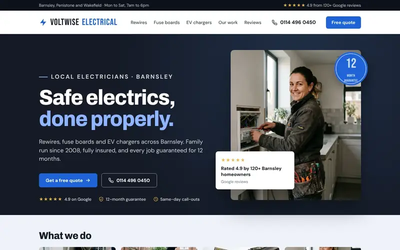
Electrics are the job people are most nervous about hiring for, so registration and safety do more work on an electrician's site than on almost any other. The best ones put the NICEIC or NAPIT registration number near the top, give rewires, consumer units, EICRs and EV chargers their own pages, and handle emergency call-outs honestly. I've written a full breakdown, with my demo designs for two made-up electrical firms, in electrician website examples.
Landscaping and gardener website examples
Landscaping is the trade where the website can do the most selling, because the work photographs beautifully and the jobs are big. It's also where I see the most sites that are all photos and no information.
My Greenway Landscapes demo, for a made-up Chesterfield firm, has a menu of Patios, Driveways, Decking, Our work and Reviews, a headline of "Gardens built to be enjoyed", a five-year guarantee on patios in the line underneath, and "free design visits" in the trust row. That last one matters: for a big garden job, the first step isn't a quote, it's someone coming round.
- Caption every photo. "Indian sandstone patio and raised beds, Dronfield" tells a visitor what they're looking at and tells Google too.
- Split landscaping from maintenance. Gardeners doing regular rounds sell something different: reliability, a weekly or fortnightly slot, and the areas you cover. Don't make a regular-mowing customer dig through patio projects.
- Be honest about the season. If you're booking spring builds in January, say so on the page.
More at websites for landscapers.
Carpenter, joiner and handyman website examples
Carpentry and joinery sites live or die on the photos. Fitted wardrobes, staircases, kitchens, bespoke shelving: the work is the advert. The good carpenter website examples I've seen caption each piece with what it is, the wood and the room, and say plainly whether you do bespoke work, fitting, or both. Show the awkward alcove before and after. That's what someone with an awkward alcove is looking for. See websites for carpenters.
Handyman sites have a different problem: you do lots of small jobs, and customers aren't sure whether theirs is too small to bother you with. The best handyman website examples answer that straight away:
- A plain list of the jobs you do (flat-pack, shelves, door hanging, small repairs) and the ones you don't.
- How you charge: hourly, half-day, a minimum charge. Put it on the page.
- The areas you cover, because handyman work is very local.
- Proof you're tidy and turn up when you say. For a handyman, reliability is the whole sale.
More at websites for handymen.
Answer the worry your trade comes with
One pattern runs through every trade above: the best sites answer the specific worry a customer has about that trade, near the top of the page.
| Trade | What the customer is worried about | What the site should say |
|---|---|---|
| Roofer | Cowboys, and the leak coming back | The guarantee in words, insurance, photos of your own roofs |
| Plumber | Water damage now, and the bill | Your real hours, how you charge, a tappable number |
| Electrician | Safety and sign-off | Your scheme registration with the number |
| Plasterer or decorator | Mess in the house | How you protect floors and furniture |
| Builder | Overruns and disappearing mid-job | Your process, timescales and finished projects |
| Landscaper | Paying a lot and hating the result | Design visits, captioned projects, the guarantee |
My Smoothline Plastering demo, for a made-up Sheffield plasterer, puts "Tidy, dust-sheeted work" in the trust row next to the guarantee. It's not a clever line. It's the exact thing a homeowner worries about when they let a plasterer into the front room.
What the worst trade websites have in common
The other side of the coin, so you can check your own:
- "Welcome to our website" as the headline.
- No town named anywhere above the footer.
- A phone number that's an image, or that you can't tap on a phone.
- Stock photos, or no photos.
- One Services page with everything listed on it.
- Badges for schemes the business no longer belongs to.
- A contact form with nine boxes, and no other way in.
- A news section that stopped years ago, which makes a visitor wonder if you've stopped too.
If your site has three or more of those and the phone isn't ringing, start with why trade websites don't get enquiries. If you're thinking of building a new one yourself, my honest comparison of the best website builder for tradesmen will save you some trial and error.
Trade website questions, answered
What should a tradesman's website include?
At the least: the trade and town in the headline, a phone number you can tap on every page, a page for each main job, the areas you cover, your own job photos, reviews, any registrations with the number, and a short contact form. Everything else is extra.
How many pages does a trade website need?
Usually somewhere between five and fifteen: a homepage, a page for each job you want more of, an about page, a reviews or work page and a contact page. Add a page per town only when you have something genuinely useful to say about working there.
Should a trade website show prices?
Show how you charge, even if you can't show exact prices: call-out fee or not, free quotes or not, a "from" price for common jobs if you're comfortable with it. Customers are trying to work out whether you're in their budget before they ring, and a little honesty saves you calls from people who aren't.
How much does a website like these cost?
Anything from a few pounds a month if you build it yourself to several thousand from an agency. I've laid out every option in how much a website costs in the UK.
Want to see these patterns on your own homepage?
Every demo I've described here was designed by me, for the trade, around how that trade's customers choose who to ring. If you want to see what yours would look like, I'll design your homepage within 24 hours of our set-up call, before you pay a penny. If you like it, the full Job Winning Website is £497 one-off, live within 7 working days of your start date, and you own it. If you don't like it, you walk away and owe nothing.
And if your current site already ticks most of the boxes above, I'll tell you that too. Ask for your free website mockup here.